
Visual Identity
Ícaro · Casual Greek Food
A complete visual identity for Ícaro, a casual Greek restaurant in Curitiba: a symbol inspired by the myth of Icarus, carried from the menu to the delivery bag.
See Ícaro on InstagramConcept
Icarus's flight, shaped like a sail.
The symbol draws on the Greek myth of Icarus: feathers that become wings, and wings that become a sail. The blue gradient lines evoke the movement of flight and the Mediterranean, coming together in a shape that also recalls a shell, a symbol of origin and passage.
The goal was to translate, in a single mark, the lightness of a casual restaurant and the heritage of authentic Greek cuisine, without falling into the tired blue-and-white cliché so common in this segment.
Symbol anatomy
Every stroke has a reason
Gradient feathers
Six tapered strokes, from navy to sky blue, represent the feathers of Icarus's wings.
Shell / sail
Together, the feathers trace the outline of a shell and the shape of a sail catching the wind.
Hand-drawn lettering
The name "Ícaro" is hand-drawn, with angles that reference the classical Greek alphabet.
Color palette
From the Mediterranean to Curitiba
Four tones that carry the whole identity, from the logo to printed applications.
Typography
Classic elegance, contemporary readability
Casual Greek Food
Headings: Caesar Dressing
Casual Greek Food
Body text: Playfair Display
Variations
A mark that adapts to any surface
On light

White on navy
Monochrome
Negative
Applications
From the table to delivery
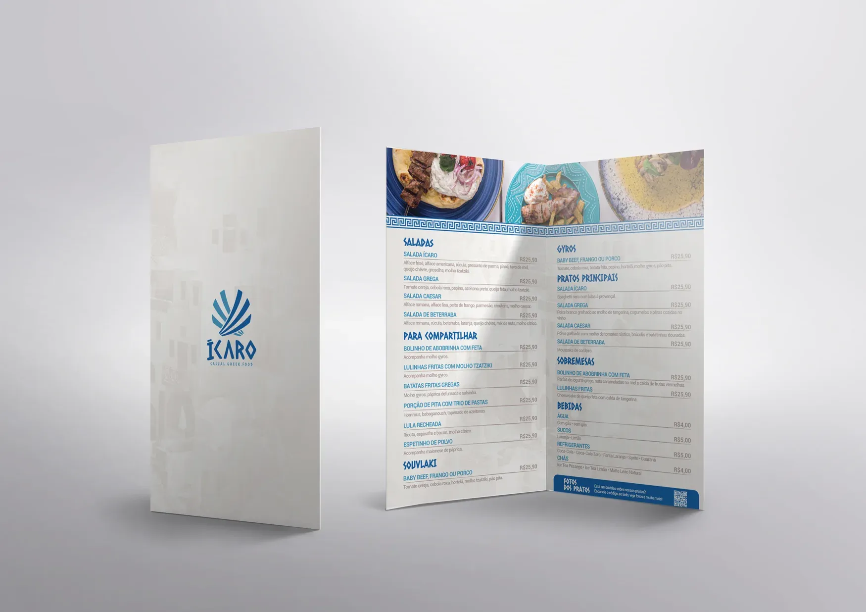
Printed menu with a Greek key pattern along the header and the mark on the cover in blue over light paper.
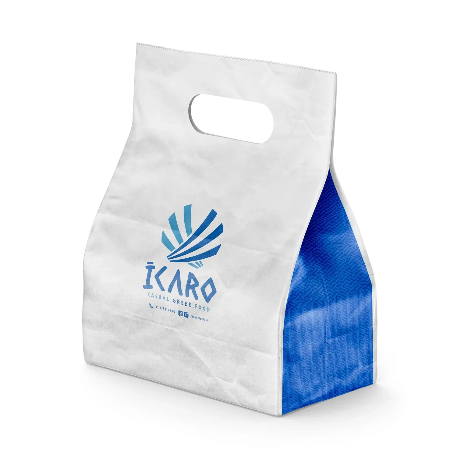
White kraft paper bag with the mark centered and one side in blue with a Greek key pattern, reinforcing the brand even when closed.
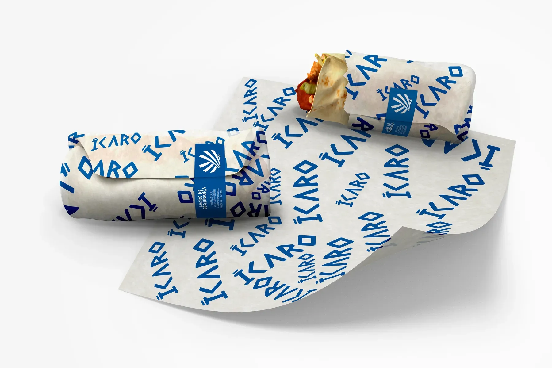
Repeating pattern of the brand name on kraft paper, used to wrap gyros and wraps, reinforcing the brand in every detail.
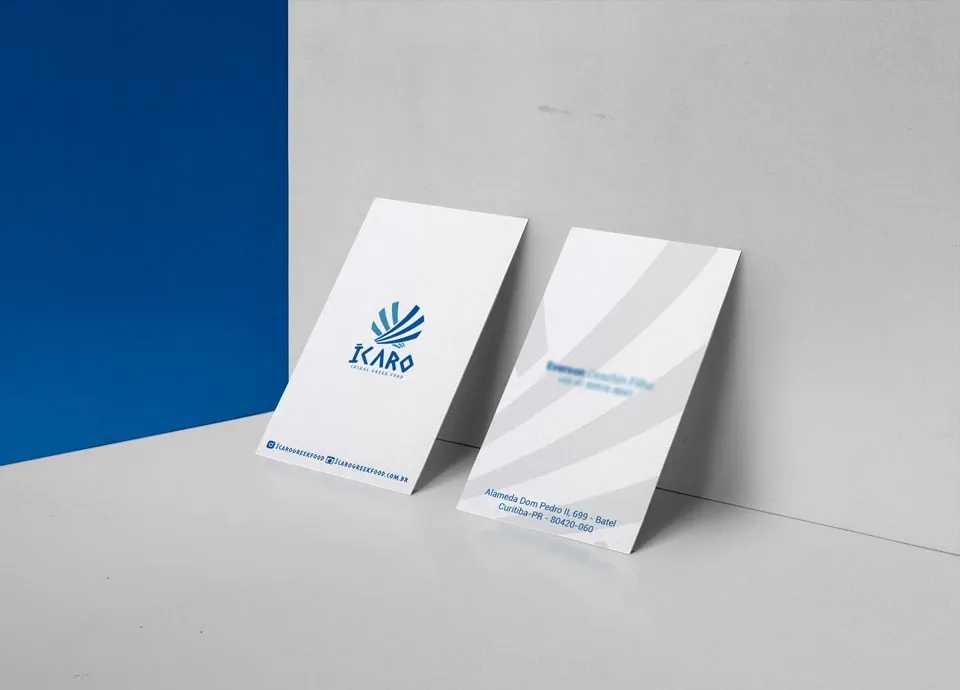
Business card in deep blue, with the mark in white and contact information in a discreet line.
Environment
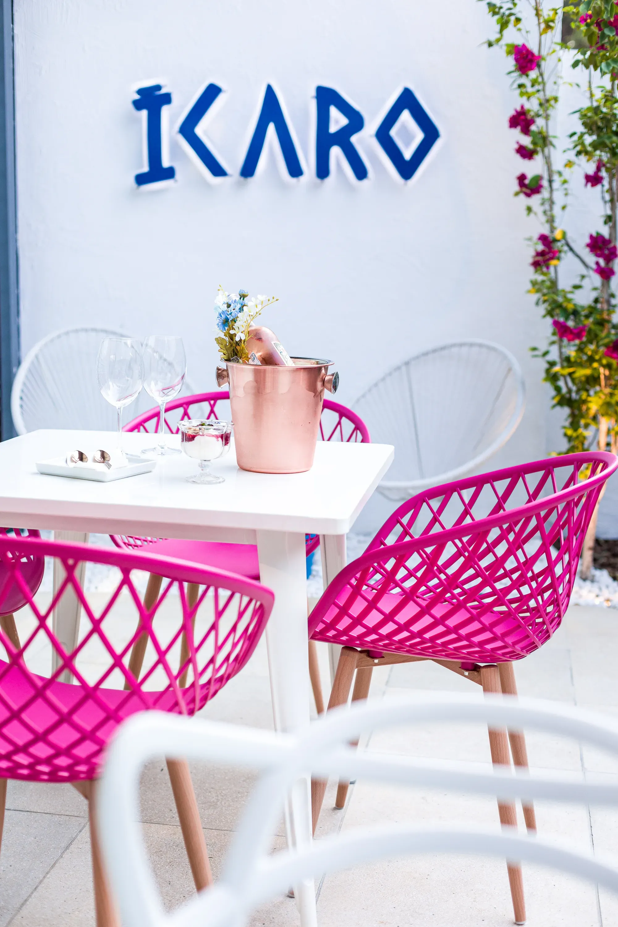
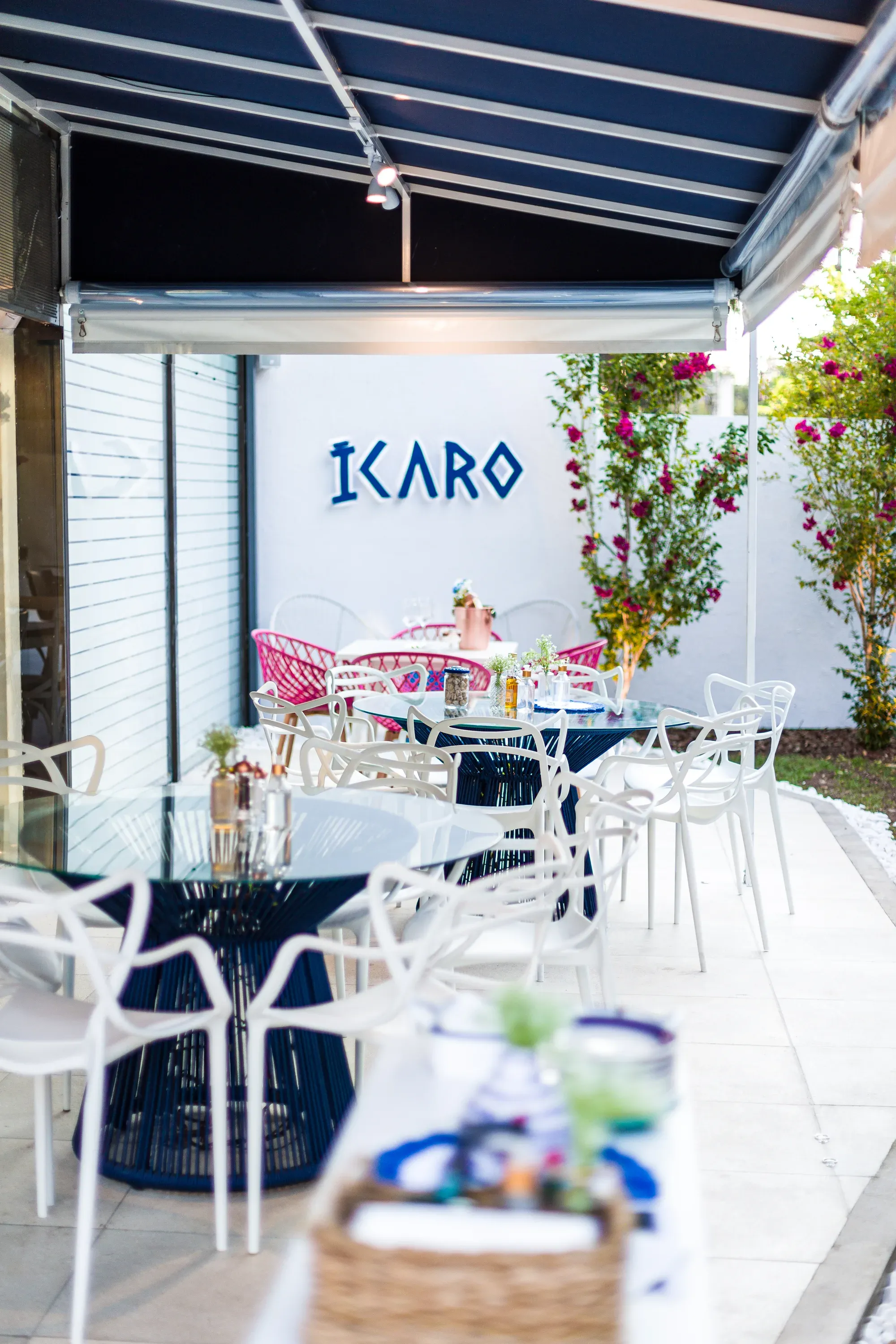
The brand brought to life in physical space
Need a visual identity like this for your brand?
From concept to everyday applications, from zero to production-ready.