02 / 11
My own product
vora
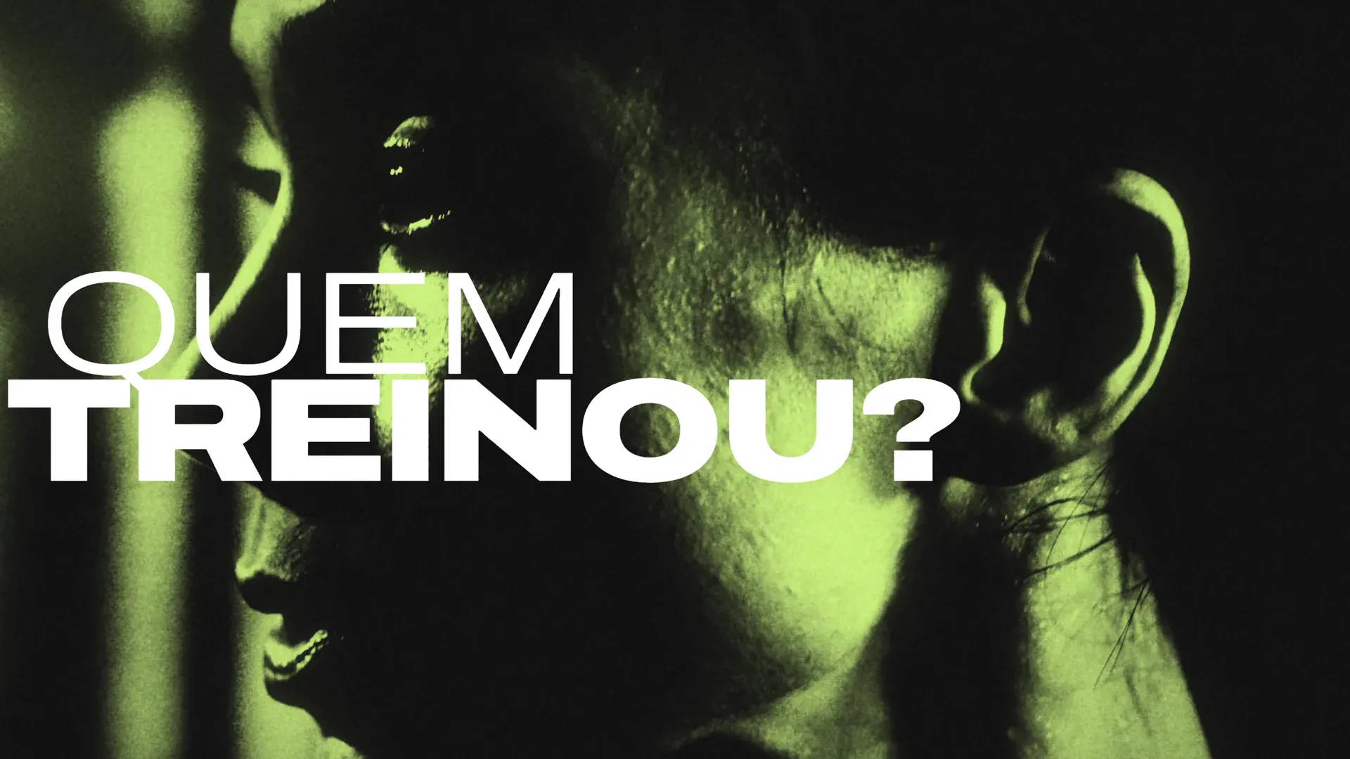
You coach. vora checks if it works.
I founded vora and made the brand, the app, the watch app, the website and the video.
01The idea
The trainer writes the workout.
vora is one app with two sides. The trainer builds the workouts, follows each client, runs the schedule and bills the monthly fee. The client opens the workout on their phone, goes set by set and sees their own progress.
vora does not prescribe. No screen suggests a workout, a load or a goal. It calculates and shows each number with its definition, with no good or bad label. Even the AI follows the rule. It reads the client's numbers and writes what the trainer may want to review, and only the trainer sees it.
For the trainer
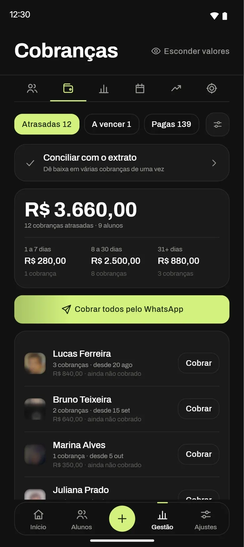
Clients, workouts, schedule and fee-free billing over Pix, Brazil's instant payment system, in one app, with each client's numbers.
For the client
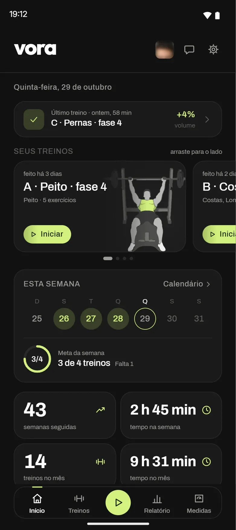
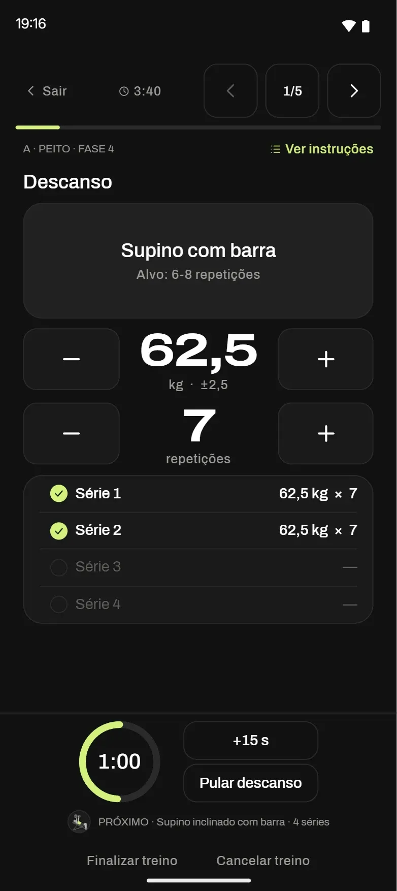
The workout the trainer built, with last time's load and the rest timer running. Works offline.
Calculates, never grades
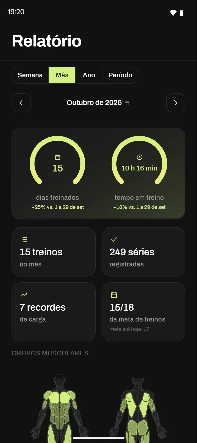
Load, goal, streak and effort show up as a number and a definition. No ranges, no good or bad badges.
02Brand
An open-stroke V on a dark plate.
The brand is my own, drawn in Illustrator. I made the symbol as a stroked V, with a notch in the middle that lands at the exact center of the plate. The stroke carries the brand gradient, from green to yellow. In the app, that gradient only shows up for a real achievement: a goal met, a personal record, a finished workout.
The rounded base of the V became an interface rule. The app's cards got a larger corner radius to match it.
03Color and type
A dark background, a single green.
vora has no light mode. The background is near black, the surfaces step up in close grays and lime marks the main action on each screen. The other greens come from it: a darker one for the button, a softer one for what is selected and a dark ink for the type on top.
Brand gradient
#D2F17E → #F1ED7E
One family, three voices.
Archivo Expanded Bold, in all caps, sets the headlines in the video and on the website, and the big load number in the app. Archivo Regular and Medium set the text. Labels go in monospace, all caps, like a lab sheet.
YOU COACH.
Headlines · Archivo Expanded Bold
Set by set, with last time's load and the rest timer running.
Text · Archivo Regular and Medium
THE PERSONAL TRAINER'S APP
Labels · System monospace
04Voice
A performance lab.
vora talks like a training log: short, dry and exact. It measures and counts, and leaves the opinion to the trainer.
Calculates, never grades.
vora shows the number and says what it means. It never calls it good, bad, high, low or ideal, and it never recommends. The trainer decides.
A performance lab.
Short, dry sentences, imperative verbs, training words: session, load, set, record. No exclamation points, no cute diminutives, no motivational lines. An achievement shows up in the brand gradient, never in a shout.
vora, lowercase.
"vora" is always lowercase, even inside an all-caps headline, with no article in English. The core noun is "workout", never "routine".
Train. Measure. Progress.
On track. Cooling off. Stopped.
Every session becomes a number.
Only the numbers reach the AI. Name, email and photos stay out.
Only you see it. You decide.
05Interface
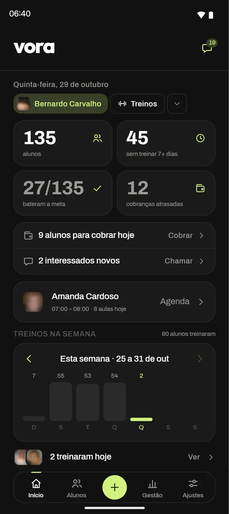
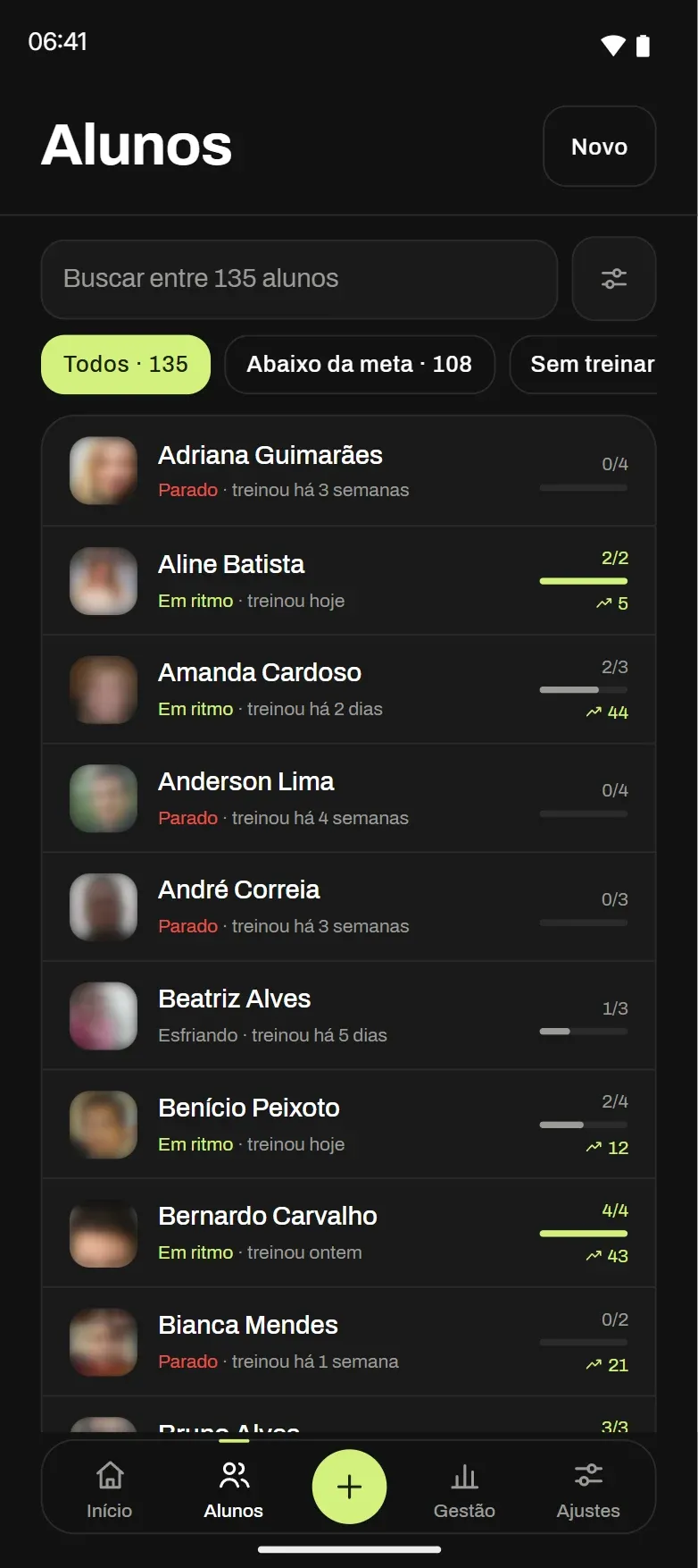
The client trains. The trainer follows along.
I designed every screen on both sides. The client sees today's workout, goes set by set and tracks progress. The trainer sees who trained, who went quiet and who hit the goal.
06Desktop dashboard
A wider view for the trainer.
Trainers also use vora on the computer. It is the same app, open in the browser, with the same account, the same rules and the same numbers as the phone. Only the design changes: a sidebar menu, clients in a table with columns, the schedule as a weekly grid and the client profile in two columns.
The desktop view is for trainers only, to build workouts, read the numbers and manage the schedule and billing. Clients train on their phones.
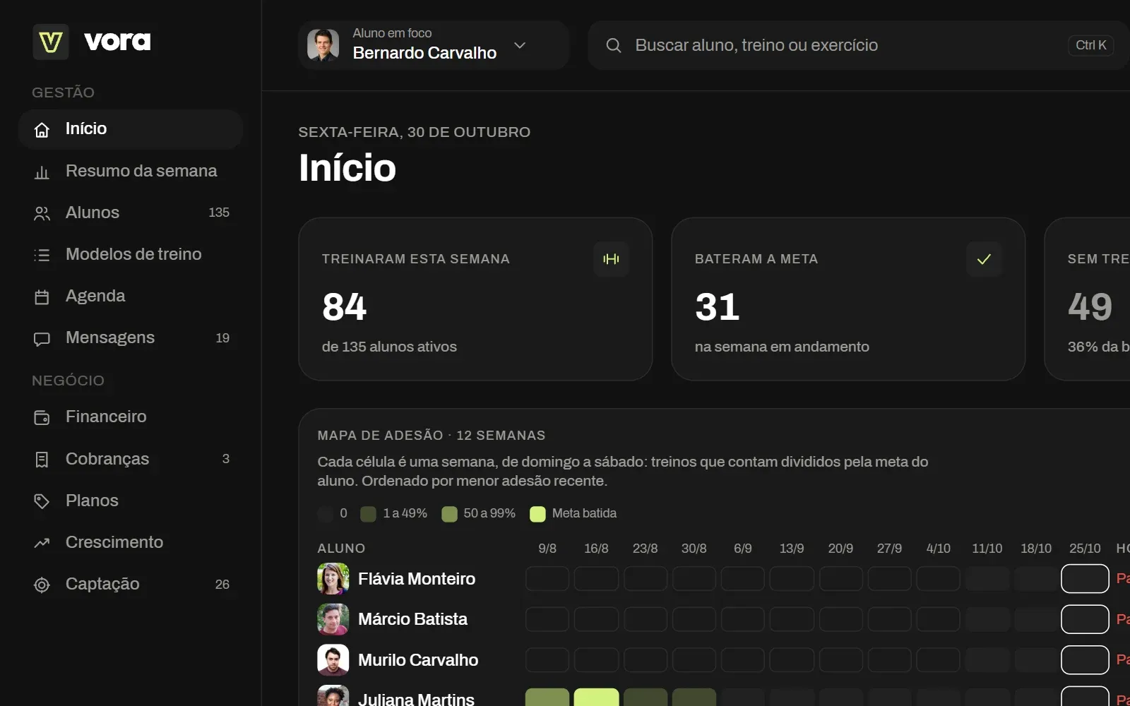
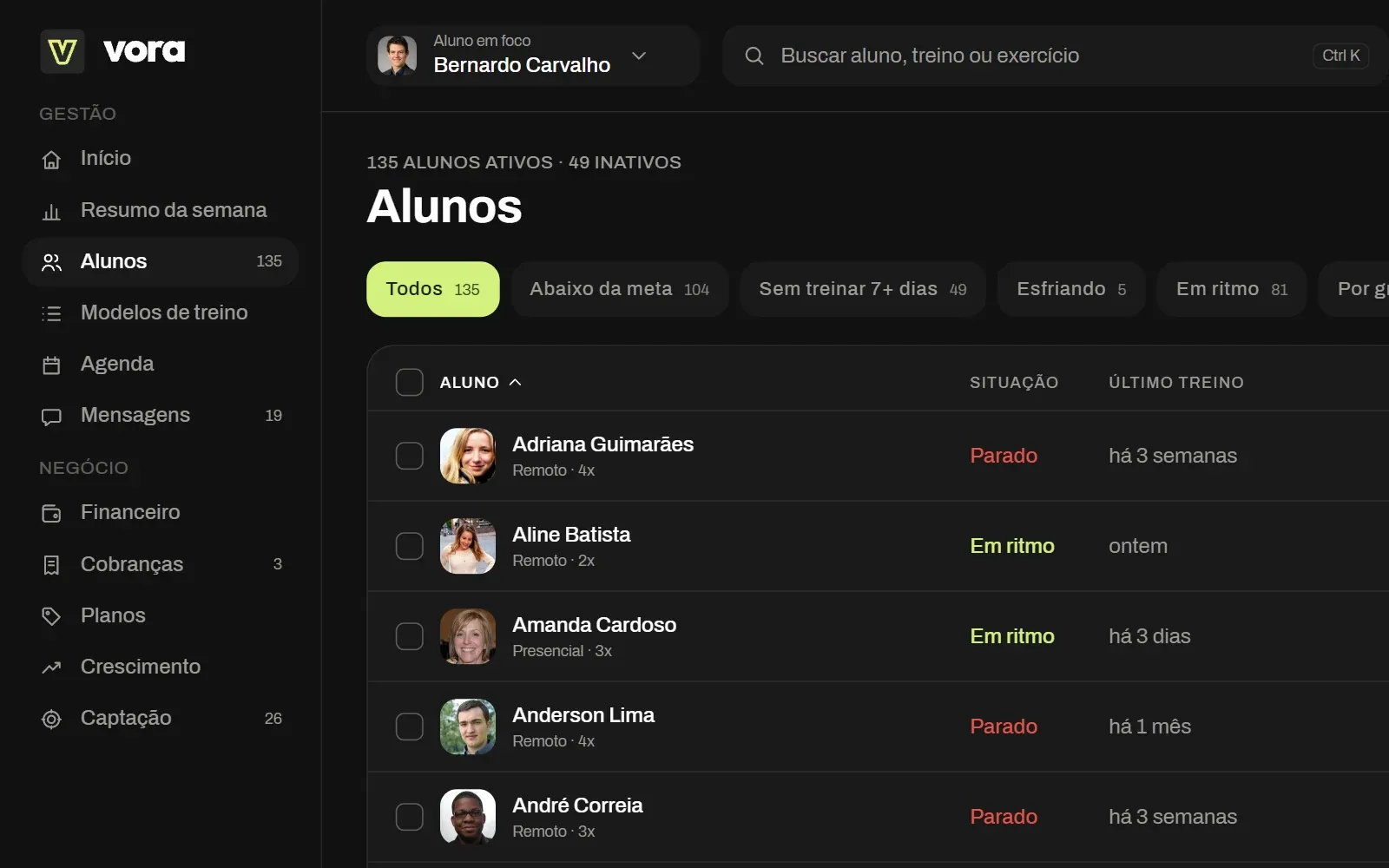
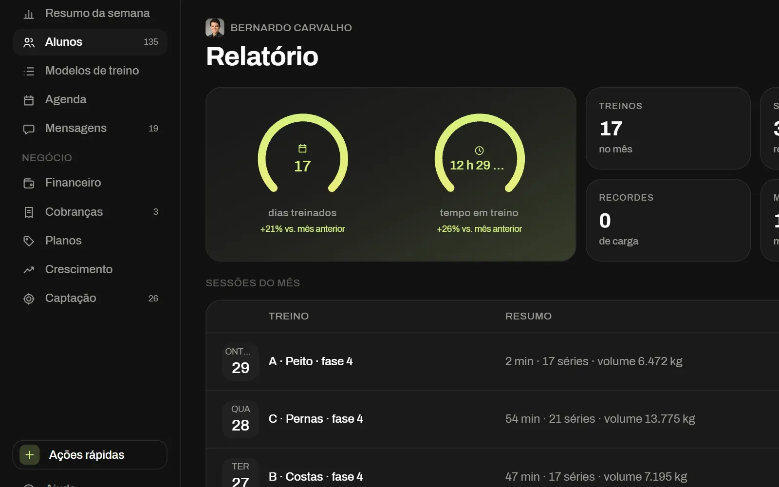
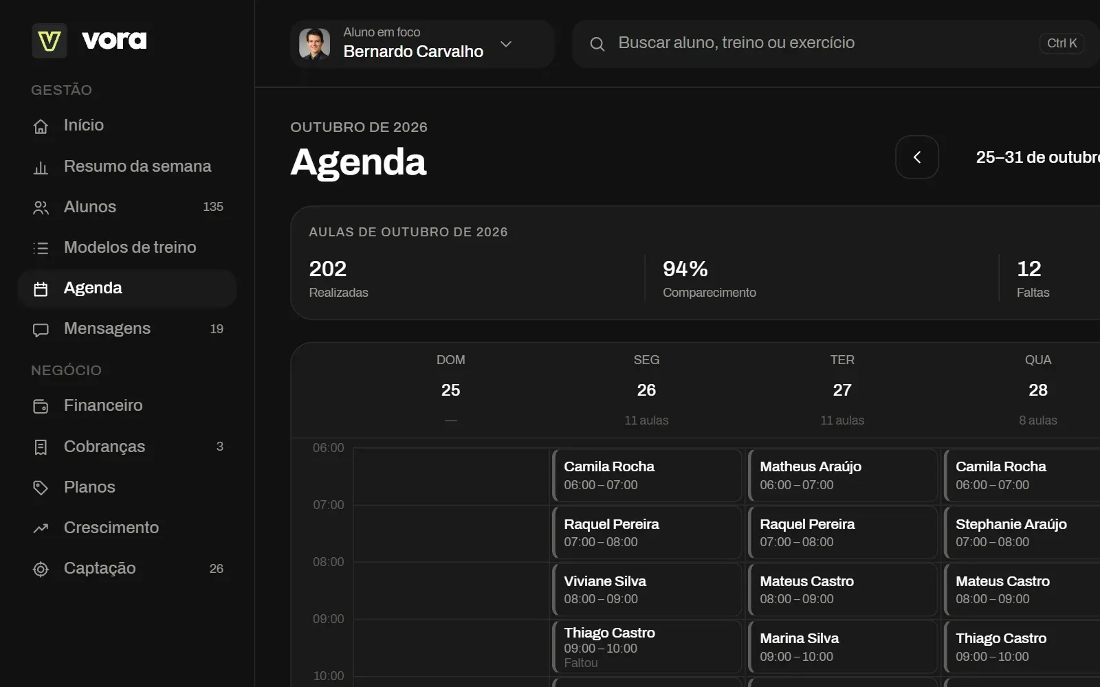
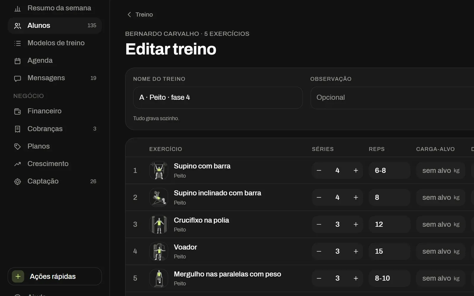
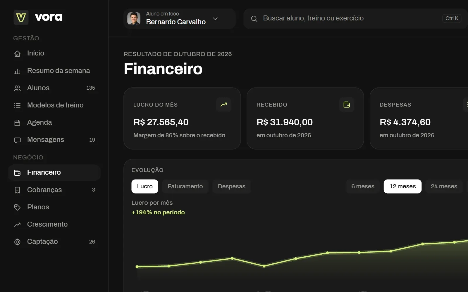
Today's numbers, the to-do list and today's sessions, in a grid.
07Beyond the phone
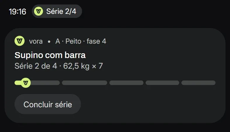
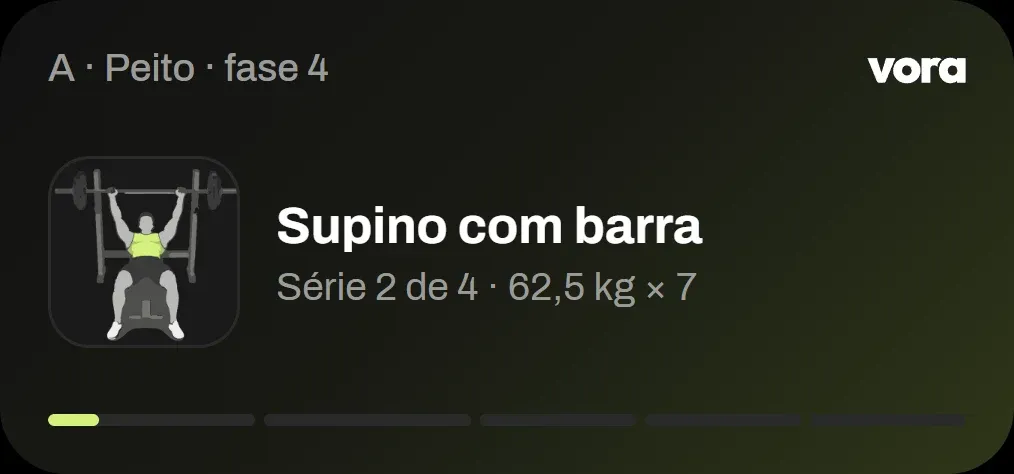
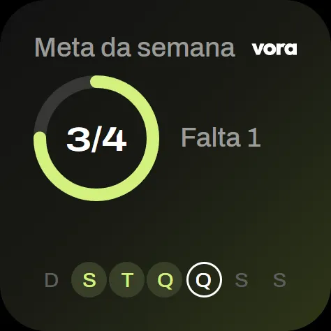
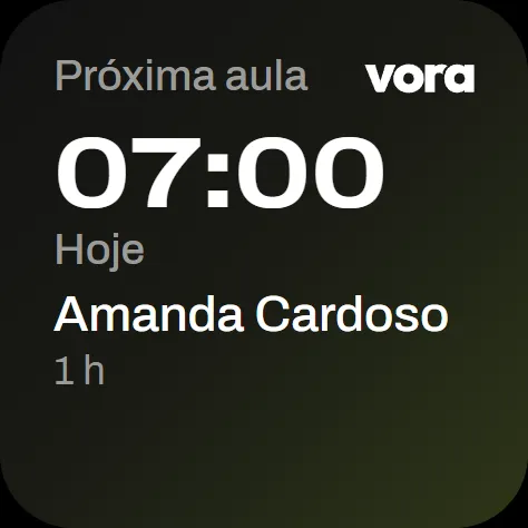
On the wrist, in the notification, on the home screen.
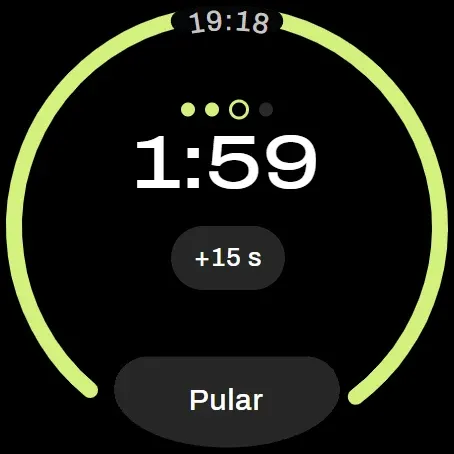
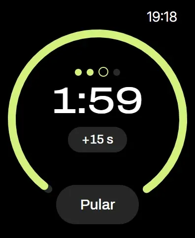
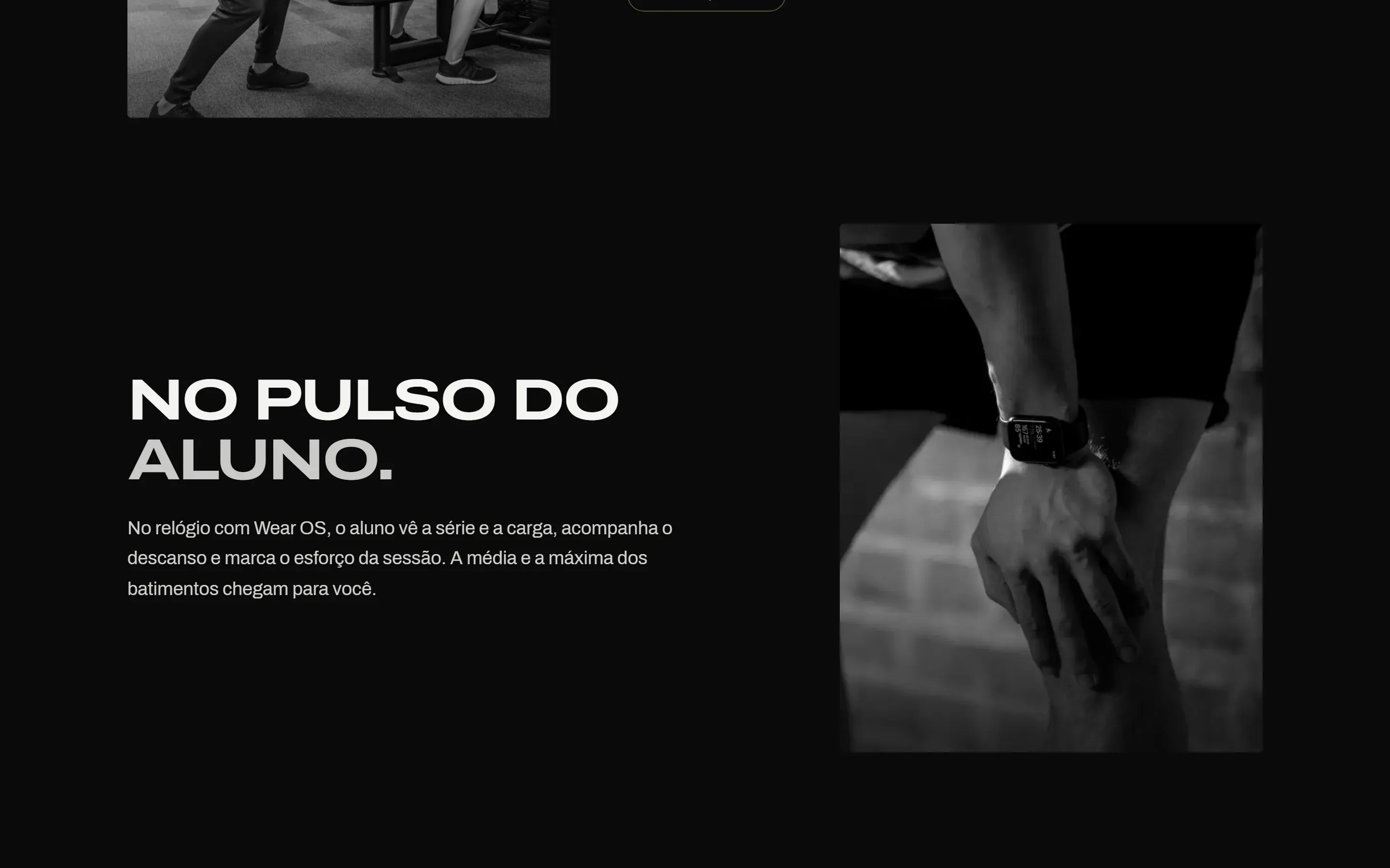
The workout is not stuck inside the app. On the watch, with Wear OS or Apple Watch, the client sees the current set, follows the rest timer and logs effort at the end. The watch controls the session open on the phone and never decides anything on its own. Average and max heart rate go to the trainer.
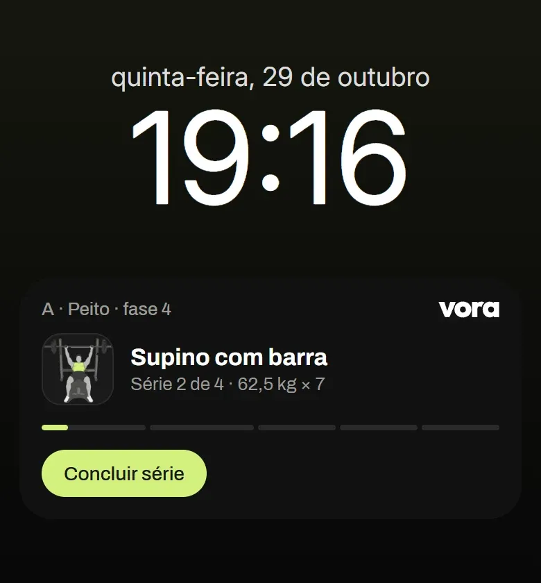
With the phone in a pocket, the live notification shows the workout bar and the current set on Android. On iPhone, the same session shows up as a Live Activity. On the home screen, widgets show the workouts and the weekly goal for the client, and the next session and today's schedule for the trainer.
08The website
The website and the trainer page.
The website speaks the same language as the app: dark background, the symbol, Archivo and the green. The main page shows the product in motion. The phone stays put while the trainer's screens change as you scroll; the client's screens slide sideways. Headlines rise word by word.
Every trainer also gets their own page on vora, with an introduction, their plans, testimonials and a form. Whoever fills it in shows up in the app as a lead and becomes a client in one tap. The /exemplo page shows one of them, with demo data.
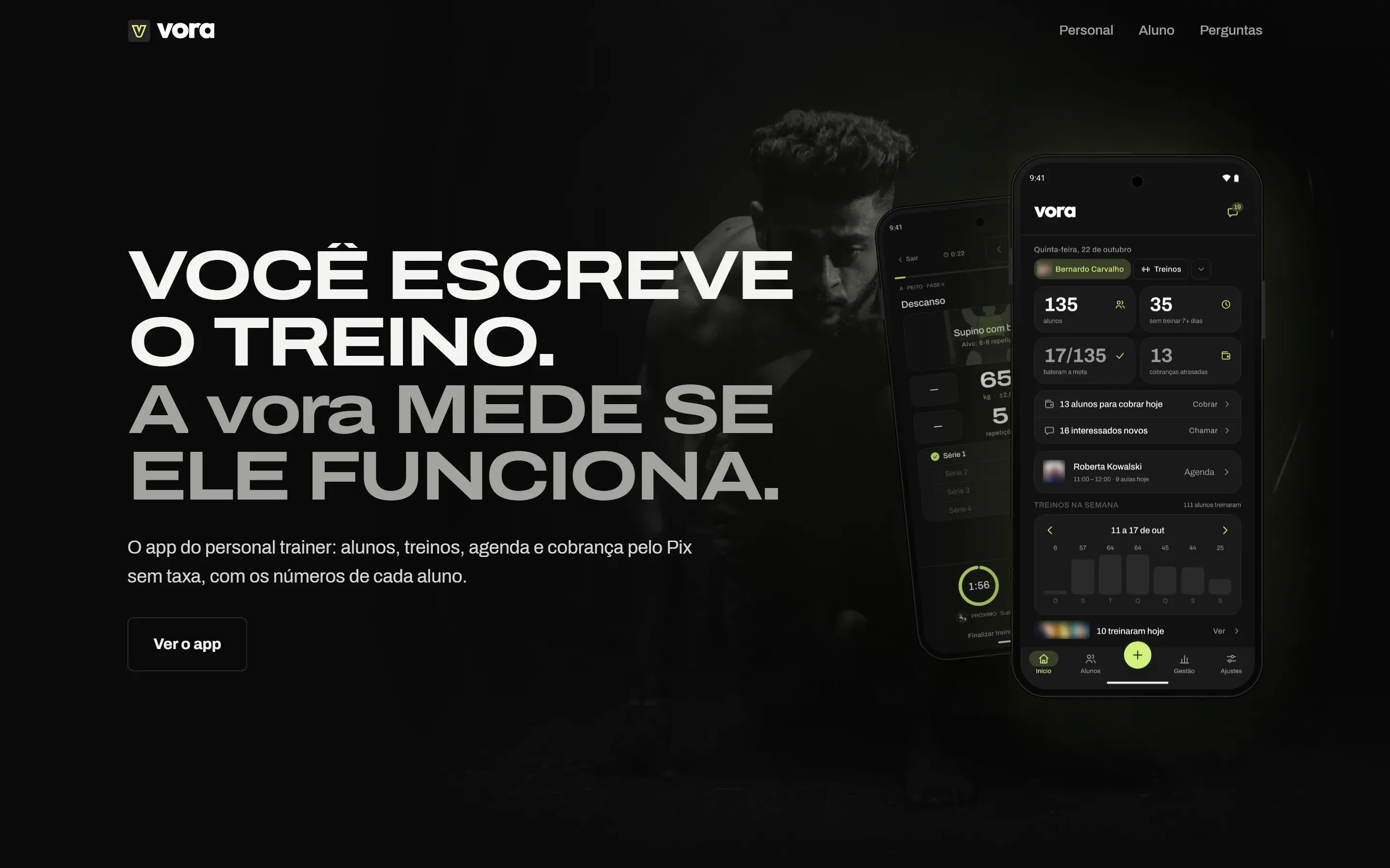
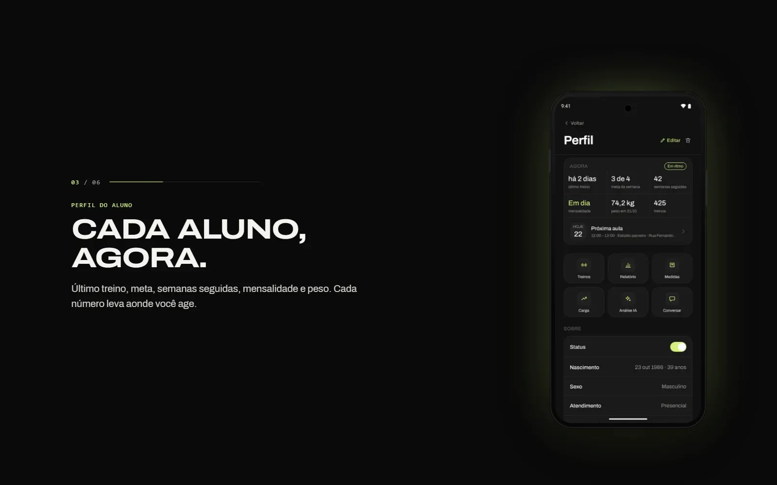
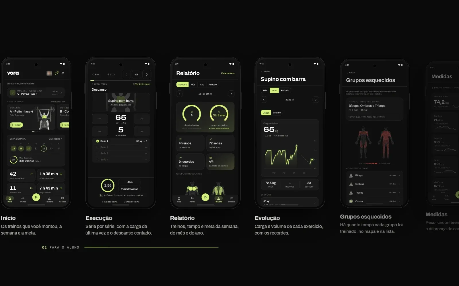
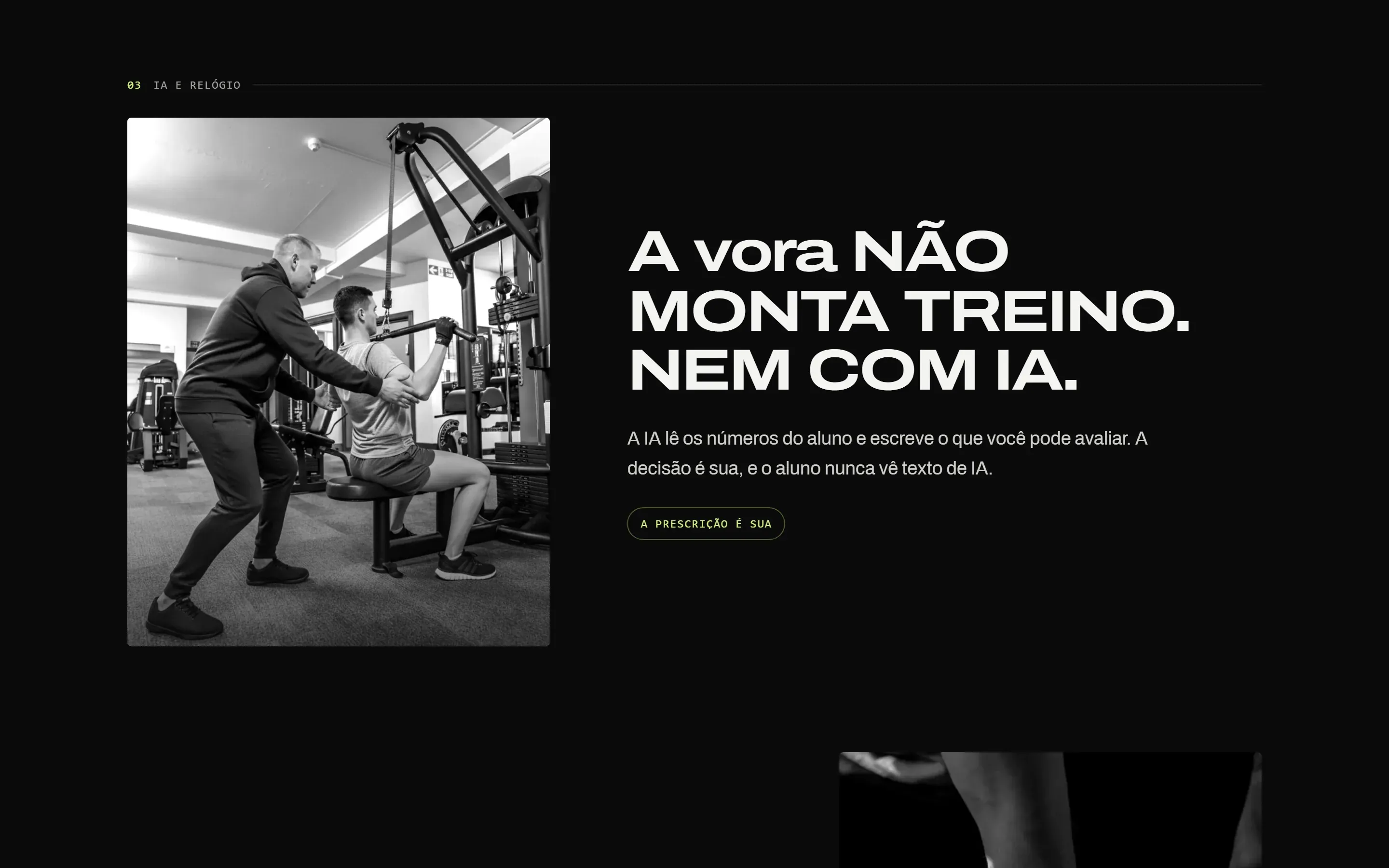
The site's headline, with the trainer's home screen and the client's workout.


09The video
No voice, on the beat.
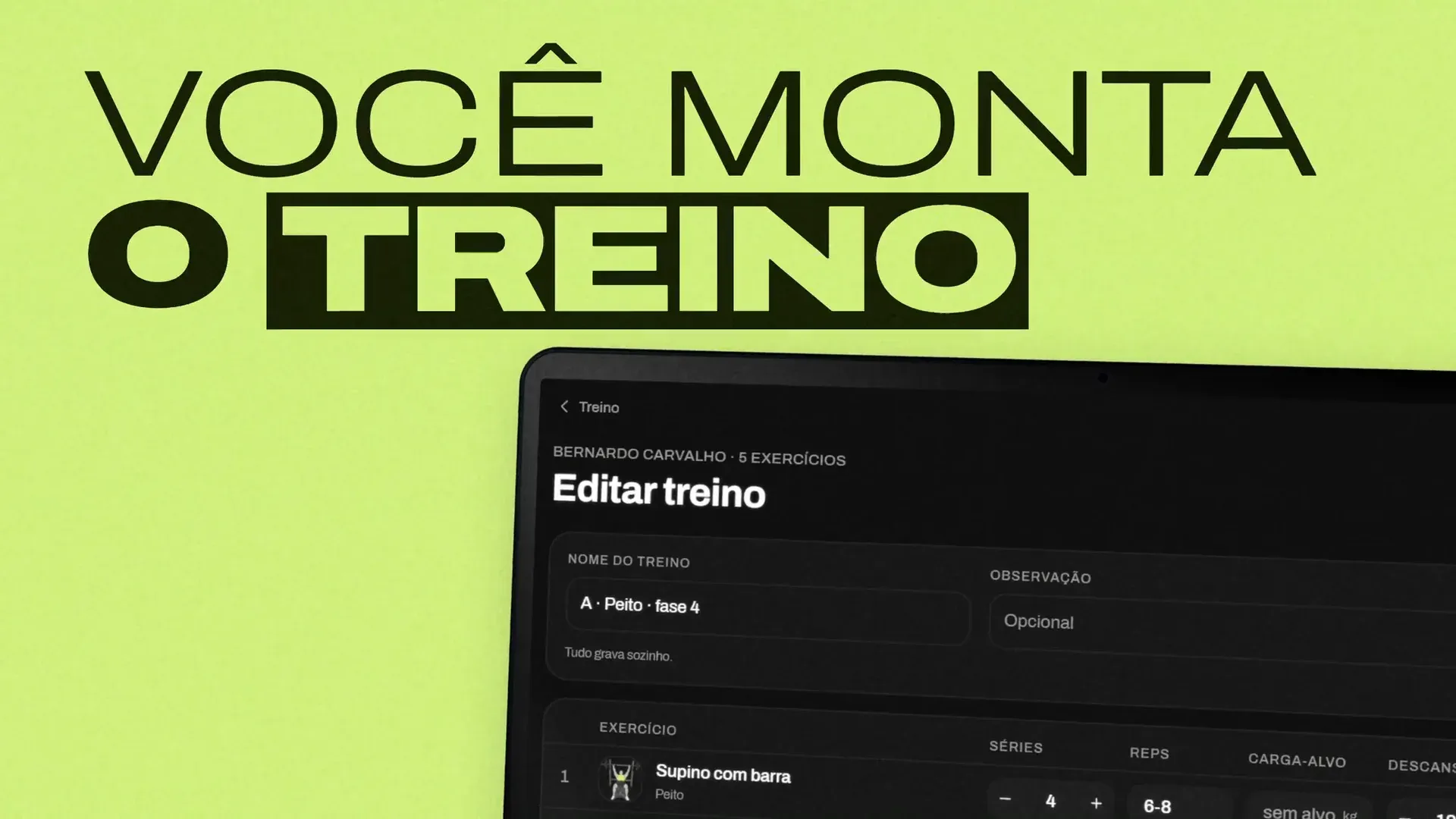
The video has no voiceover. The type tells the story and the music drives the cuts. Every beat is a rep, every bar is a set. The trainer's questions open the video, and the app screens come in as the answer.
It works with the sound off, because feeds play muted. I built it in code, with the same Archivo and the same green as the app, and every cut lands on the beat.
10How I built it
One designer, with Claude Code.
I built vora on my own, with Claude Code. The split was clear. I drew the brand in Illustrator. I decided the product, the rules and every screen. The AI wrote the code.
The work moved in short steps, and I reviewed each one before the next. When there was more than one way to go, the AI asked and I chose. Every brand and voice decision became a written rule, and that rule applied to every screen from then on.
That is how the same brand reached every part of the product, without a team.
App
Android and iPhone, for the trainer and for the client.
Watch
Wear OS and Apple Watch, with the same Archivo and the same green.
Notification and widgets
The live session and the home screen, in the app's design.
Web dashboard
The trainer's app in the browser, for the big screen.
Site
The main page and the page each trainer gets on vora.
Video
Cut to the music, set in the brand type.
Project details
- Client
- vora
- Scope
- Apps and interfaces, visual identity, video editing
- Year
- 2026
- My role
- Founder, design and product end to end
- Sector
- Fitness, technology
- Platform
- Phone, watch and web
Contact
Have a product that needs one brand, from the app to the video?
I do the brand, the screens, the website and the video, and I write the rules that keep them speaking the same language.
Direct contact